
ISTQB’s “Vision on the Future of Software Testing” made rounds on social media recently. I’m hopping on to this train with my own commentary.
The paper can be found on ISTQB website (direct link). Below, I focus solely on non-content problems with the paper, mostly editing mistakes. I have covered content in part 1.
I do not claim this list to be exhaustive. These are only things that stood out so much, that I noticed them while reading paper.
In first section, words “Vision”, “Future”, “software” and “testing” are in slightly smaller font than the rest of the text. That effect doesn’t seem to be used anywhere else in the paper. In middle paragraph, smaller font is applied to part of word (in “testers”, last two letters are bigger than letters before them).
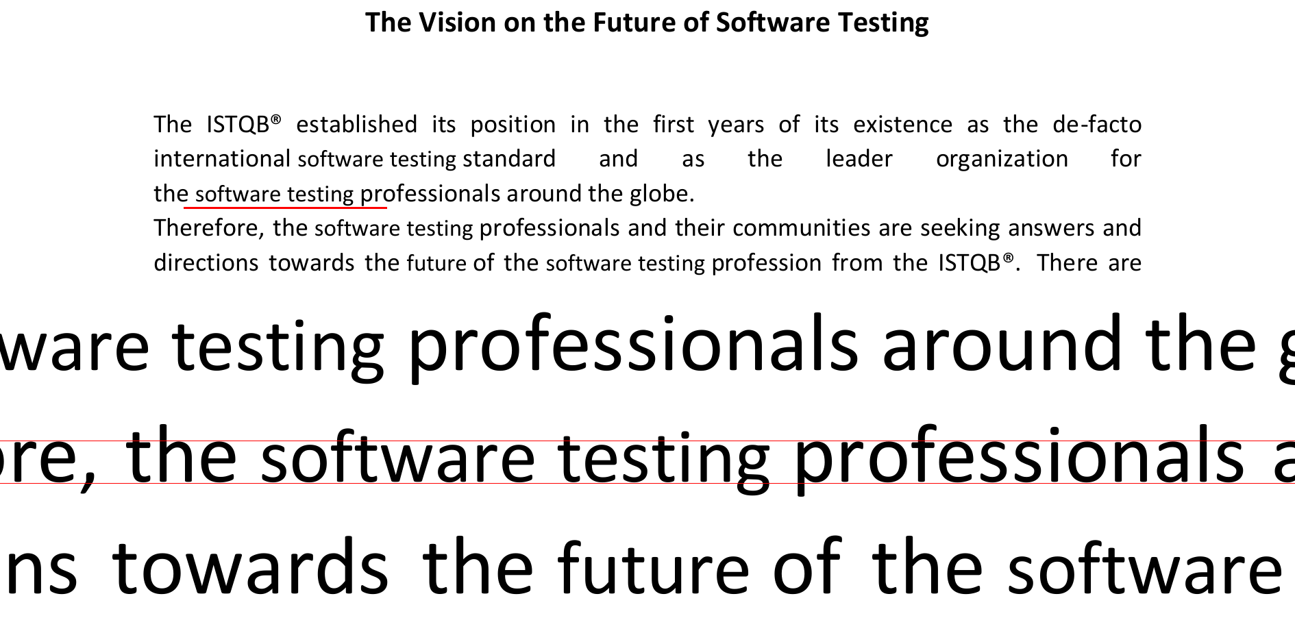
In first paragraph, there is hard line break and text continues immediately below. This is the only place where such effect is used. If it was supposed to indicate new paragraph, there should be empty line between text lines, as in rest of paper.

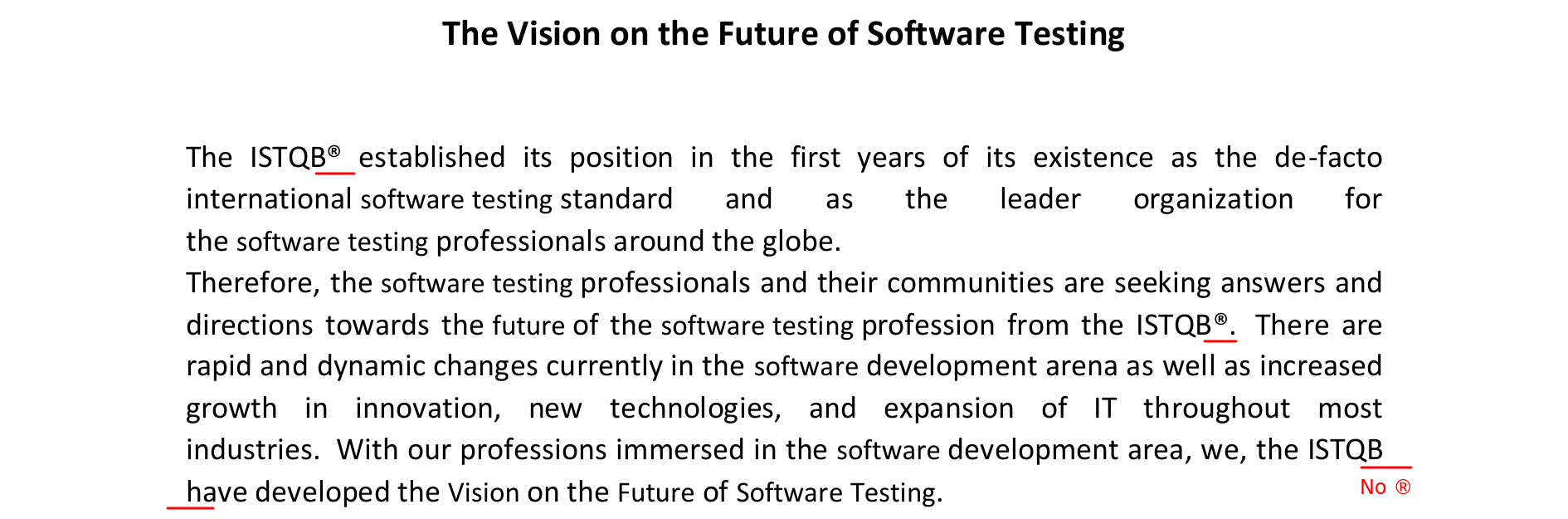
“ISTQB” is consistently followed by registered trademark symbol, except for third occurrence, where it is not.
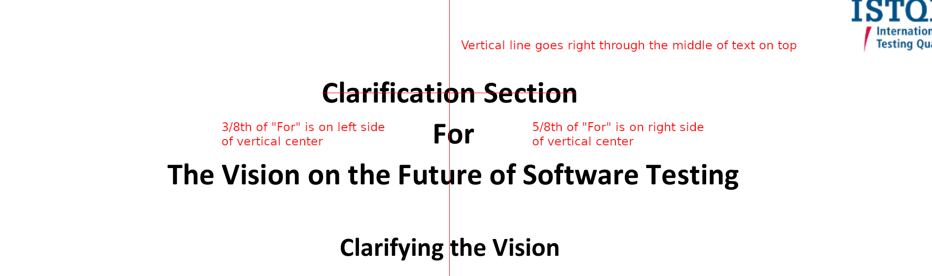
Main heading on page 4 is not centered correctly. Middle line (“For”) particularly stands out, as vertical center splits it in proportion 3/8 to 5/8. Last line is slightly moved to the right as well.
In Acknowledgements, there is stray comma at the beginning of one line.

Bill Hefley name is misspelled in Acknowledgements as “Helfley”. I find this to be particularly irking, as he’s one of the “thought leaders”. In my book, it’s not a sign of respect for a person when you can’t be bothered to spell their name correctly.
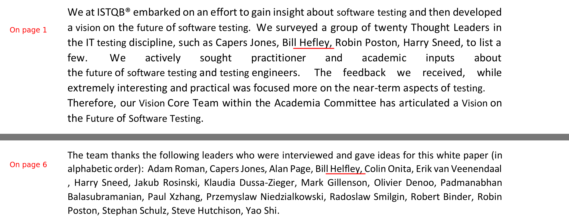
Despite the claim, list of “thought leaders” in Acknowledgements is not in alphabetical order. Capers Jones should be after Bill Helfley for the list to be correctly sorted. Not to mention that it’s customary to sort people by last name, not by first name.

There are two pages of “clarifications” for paper that is two and a half page long on its own. These proportions are way off and might be a sign that main body of work made extremely poor job at driving the message home.
Overall, I find it strange to have “clarifications”. Who wrote them, when, and why? If they are here to clarify misunderstandings that became apparent before final publication, then paper should be rewritten to avoid them. If need for clarification became clear after first publication, it’s probably still better to rewrite paper and publish new edition. Original paper and summary of changes could remain available for reference and transparency sake.
General editing sloppiness of published paper is just embarrassing. Especially surprising are mistakes that must have been introduced on purpose – things like slightly smaller font can’t happen when you just type text in Word. I might as well end on sarcastic note that ISTQB envisions future where machines do humans’ work, but they can’t properly automate editing of high school homework-long document.
Comments